

01 Nov Getting Started with Excel Pivot Tables
Howdee! An Excel pivot table is one of the most powerful tools an analyst can master. The ability to quickly generate insights from a large dataset are vital in today’s fast paced workforce. Being able to use this powerful tool will make you the go-to-person when someone needs some analysis turned around quickly. In less than a minute you can report on the min, max, sum, and average of a dataset, all without touching your keyboard.
To preface this article, this will be the first article in a short series on Excel pivot tables. This is intended to be an introductory article. Therefore, if you’re already comfortable with an Excel pivot table, I would recommend that you see one of my other articles (coming soon!) on more advanced pivot table features. With that, let’s dive in to the fun stuff!
Defining an Excel Pivot Table Data Source
Now, you might wonder why I have an entire section devoted to defining the range for your pivot table. This is one of those areas that doesn’t seem important, but a little bit of thought ahead of time can save you some pains and time in the future. To create an Excel pivot table, go to the Insert ribbon in Excel and simply click “Pivot Table” as shown below.

This will open a popup box that has the suggested range for your pivot table. If you’re familiar with VBA, this selection is known as the current region. From the cell you have you selected when you click Pivot Table, Excel will assume you want all continuous data that this cell belongs to. What does that mean exactly? You can think of it as all the data connected to that cell that is no separated by a completely blank column or row. If you have a column of all blank data but there is a header for that column, it is considered part of the data set. A good way to test this if you’re still unsure is to select a cell in a data set and press ctrl + A. This will highlight the same region a pivot table would select for you.
Now, after you click the pivot table insert button, the popup window will have a few options for you to look at before it generates the pivot table. 95% of the time I leave these options as default, especially if I’m just doing a quick analysis. One thing to point out here is that auto-selected range is made with absolute references. One way to make the range more flexible is to use dynamic reference formulas (see my post on the offset function for an example of this) to resize it based on dataset size. I think the best approach is to use a table as a data source. You can add as many rows to a table as you want and not worry about the data range not including your new data.
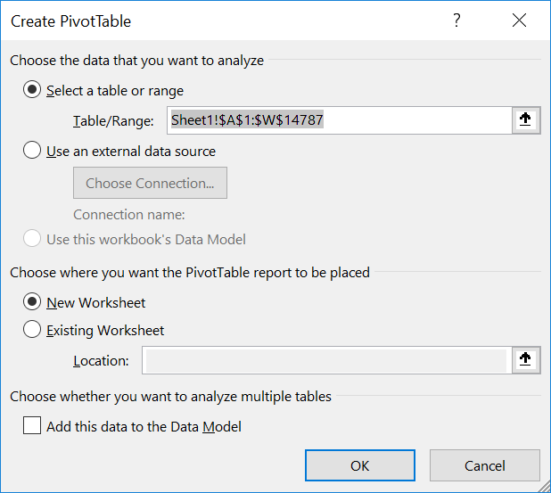 In this window, you can also hook it up to an external data source (later post in this series coming on this topic) or create it from the data model inside your workbook if you have one. If you want to add the data you’re referencing to the data model for the workbook, you can select the checkbox at the bottom of this option box. Lastly, you can choose if you want the Excel pivot table to be placed on an existing sheet or create a new sheet for the pivot table. In this example, I’m going to leave all the options as default for now. Once I click OK, the pivot table will be created on a new worksheet for me.
Adding Fields to an Excel Pivot Table
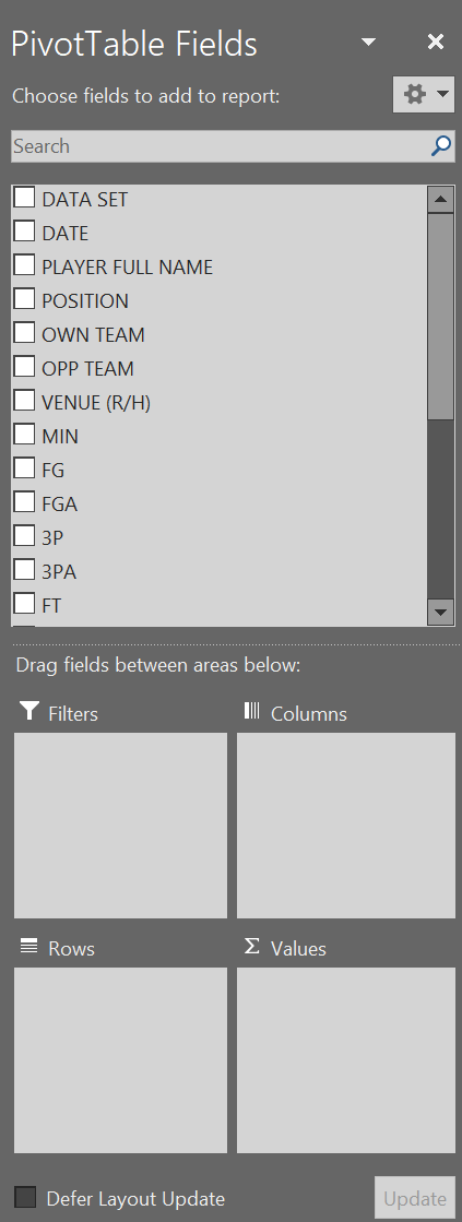
When the pivot table is created, it will be blank, and we need to add some fields to it. On the right, you’ll see a new pane that is labeled PivotTable Fields. The first section you’ll see is a list of the column headers from your data set with checkboxes next to them. These are the fields available to use in your Excel pivot table. As usual, I’m using NBA data for my example today. These fields can be dragged into one of the four categories you see at the bottom of the pane. Dragging a field to the filters section will create a single dropdown above the pivot table for that field where a user can select one or many options from that field to pivot on. In my example, I’m going to drag the Venue filed to this section, so a user can filter by road and home games. The rows section of the pivot table is used to determine how you wish the values to be grouped by on each row of your pivot table. For now, I’m going to drag own team to this section, so we can see data for how each team performs. The columns are of the pivot table performs the same action for columns that the rows section performs for rows in our pivot table. I’m going to put position here, so we can group our data vertically by position. Now with those out of the way, we are ready to add some values to our Excel pivot table and do some analysis! I’ve started with just adding points to the pivot table. Here is what those results look like:
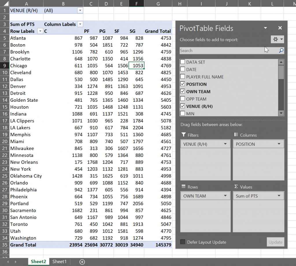
As you can see, we quickly were able to aggregate points scored by position and team with just a few clicks. This is where the power of pivot tables come in, you can quickly aggregate and dissect data for analysis without a lot of knowledge of formula syntax.
Adjusting Value Field Settings in an Excel Pivot Table
Organizing your Excel pivot table is only half of the work. To finish it off, you’ll need to do some fine tuning to your data fields. This is done through the Value Field Settings options. You can right-click on any item in a pivot table to get to the value field settings menu or you can click on the arrow of the field where you dragged it to it’s section of the pivot table and access it that way. You’ll most commonly be editing this for the field in the values section of the pivot table.
The first tab in the pop up is Summarize Values as and contains a section where you can change the calculation for that property. Excel will try to guess (usually incorrectly) what you want the calculation to be and it usually is either sum or count depending on the data type you drag to the field. In this popup you can change to average, min, max, and a host of other handy calculations. You can also set the number format of the field here and that’s particularly useful if you’re operating on versions of Excel prior to 2016 (perhaps 2013 but I don’t have a way to test it unfortunately). If you just format cells like normal from the Home ribbon, changing the pivot table will lose formatting changes since it’s an embedded object in those cells. This was fixed in Excel 2016 and if you’re using Office 365, but was an issue I had to avoid for a long time when preparing reports people would be interacting with.
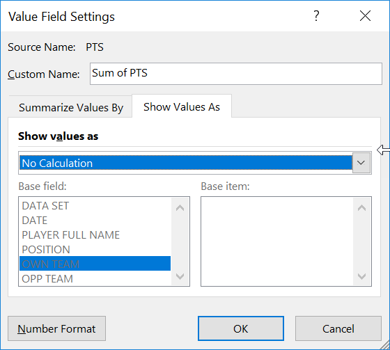
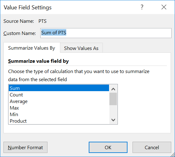
The second tab in this popup is the Show Values As and is defaulted to No Calculation. This is a super handy trick to look at data as % of its total or parent. This is really great when you’re trying to look at financial data or any other data set where it’s useful to look at it from a more common size approach. To get started, change the dropdown from No Calculation to one of the available selections. I most often use % of parent or one of the % of row total methods. These are life savers when working on budgets and you need to do year over year comparisons quickly. I’ll cover some of these in depth in a later article in this series. For now, just be aware that they exist.
Excel Pivot Table Ribbon Tools
Lastly, I want to briefly go over some of the basic options you should know about in the PivotTable Tools section of the Excel ribbon. This section of the ribbon is only displayed while you are selecting a cell inside of a pivot table, and it contains a lot of useful shortcuts. The most common one here is the Refresh button on the Analyze section of the ribbon.
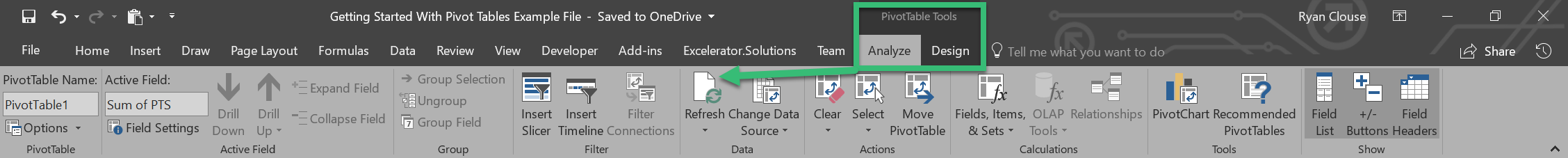
This button is how you refresh the data your pivot table is hooked up to. When you create a pivot table, the data is loaded into a cube where every possible calculation is stored. That is how the pivot table is able to pull information together so quickly. The calculations are already done, and the pivot table is only navigating the cube to find the information you want. When you refresh the pivot table, you are emptying the cube and pulling in the fresh data and performing the calculations again. This is why I stressed the importance of selecting your data range earlier. Clicking refresh only works if your data range is completely covered by the pivot table. If you’ve added rows outside of the selected range, you can use the option next to refresh, “Change Data Source”.
That is all I wanted to cover today on the Analyze tab as I’ll go over the others in greater detail later. However, I want to point out the other section in PivotTable Tools. The Design tab. This is really useful for quickly changing the design and layout of the pivot table. You can change the color scheme, add banded rows or columns, remove column and row headers format, and most importantly, you can adjust how the pivot table is organized using the layout section. I was planning to cover this section in this article, but I feel it is getting a bit long, so I’ll include it in one of the next in the series. If you have questions over what was covered in this article, feel free to comment below or write to me in the contact section.
As always, this example file is available to free subscribers to my site so feel free to sign up to grab it and other example files from my other posts.
Cheers,
R
No Comments