

25 Sep Using Power BI to Enhance Excel Data Visualization
Howdee! Data visualization is one of the biggest terms being thrown around right now. From companies like Domo, to Tableau, to Microsoft’s Power BI, data visualization is the hot item right now. To those of us that have been working in Excel for years, this concept is not new. You’ve likely been using data visualization every day of your career. However, the problem being faced right now is that charts made in Excel tend to look and behave like charts made in Excel. They don’t have fancy tooltips, drilldown capabilities, or the level of interactivity found in these new data visualization tools.
Now, I’m not going to tell you that I think these tools will ever replace Excel. They won’t. They simply aren’t going to be flexible enough to perform quick what-if analysis on the fly like you can with a well-built Excel model. However, as analysts, we need to utilize ALL the tools we need to effectively communicate our analysis. At one point, Excel was the only tool you needed to do this, but that isn’t the case anymore and we need to adapt to the change. So, today I’m going to go over the basics of how to import data to Power BI from Excel and perform some basic data analysis. The first thing you’ll need to do is download Power BI Desktop at this link.
Import Data to Power BI from Excel – Getting Started
Once you have your Power BI Desktop software downloaded and installed, it’s time to prep your Excel data so Power BI can consume it. If you’ve ever worked with Power Pivot, you know that your Excel data should be in a table to consume it into your Power Pivot data model. Power BI operates much the same way. When you consume your Excel data, you’re storing it statically in a data model inside the Power BI file. To consume new data added to the table, you must refresh the data model.
For today’s example, I have a table of some NBA stats from last season. I recommend storing your Excel data table in a OneDrive folder. Power BI works very well connecting to files stored on OneDrive and I’ve only ever had one issue with the data refresh which Microsoft helped resolve very quickly.
When you open Power BI, you’ll have a blank canvas to design your report and a lot of fields that may look foreign right now. Let’s import some data to make sense of that. To import data to Power BI from Excel, click “Get Data” on the Home ribbon in the External data group. In the dropdown that appears, select “Excel”.

From here, you’ll navigate to directory where your data table is saved and select the file to import. Once you select the file, you’ll get a window that will list all the tables and sheets within the workbook. This is why I recommend putting the data in tables and naming the table. Click the checkbox of the table you wish to import and a preview of your data will load on the right. In the preview, you can remove columns you don’t wish to load into the data model. Then click “Load” in the bottom right to load the table into your data model.

Once you click Load, Power BI will create the connection to the workbook and load the selected data into the model. It will appear in the pane on the far right labeled “Fields”. Each data source you load into the data model will appear here. If you click the checkbox next to any of the fields, Power BI will auto-create a visual based on the data type you selected. If you select a field of text, it will likely auto-generate a table, if you select a field of integers, it will likely auto-create a bar chart visual. This is a quick way to get started without having to select your visual ahead of time.
However, most of the time you’ll be selecting a certain visual from the “Visualizations” pane beside the “Fields” pane. If you hover over the icons in this pane, you’ll get a tooltip describing what the visual type is. Once you select a visual, a new section will auto-generate below the visualization icons. This will have all the available parts of the visual you selected to which you can apply your data. From there, you can drag and drop the various fields to begin populating your visual. Below, I’ve selected a basic bar chart and dragged points and team to the fields. Power BI quickly renders this into a bar chart of total points by team. In Excel, I would have needed to consolidate this data first. By choosing to import data to Power BI from Excel, I’m letting the data model do the heavy lifting for me.

From here, I could add legends to see details like home games vs road games to the chart, change the chart type, or even add other values to my chart. For the sake of article length, I’ll let you play around with that on your own. I want to move on next to creating your own measures using the DAX language.
Import Data to Power BI from Excel – DAX Measures
If you’re familiar at all with Power Pivot, you probably know what DAX is. For those of you new to the topic, DAX stands for Data Analysis Expressions. When you import data to Power BI from Excel, you’ll have to use DAX functions to perform calculations on your data instead of Excel formulas. This can be a bit intimidating to some, but the language is really very familiar to working with Excel functions with a few differences.
One thing to note is that DAX measures are attached to the data set, not the field. So, the easiest way to get started is to right-click the data set you want to perform the calculation on and select “New measure”. A formula bar will appear below the ribbon with the text “Measure =” in it. It will be highlighted since it’s common practice to overwrite this. When creating a measure, everything to the left of the equals sign is title of your calculation while everything to the right of the equals sign is the calculation.
Sticking with our example from above, I’ve realized that looking at total points by team isn’t very useful. Teams could have played more or less games so my data isn’t really comparable. It would be much more useful to look at this visual as a points per game calculation. However, this data is grouped by player and team so I can’t just do a straight average of the data. For example’s sake, I’m going to use a calculated column to help this measure.
A calculated column is a column you add to your data set and returns a result for every row within your dataset. In this example, I need to know the distinct number of games that each team has played. I could perform a distinct count, but it can only accept one column as an input. So, I can use a calculated column to concatenate the date and team name together so I can perform a distinct count on this new column to get the number of games played. This is my general approach to using calculated columns. If my dataset needs a little adjustment, I can use the calculated column instead of altering my raw data inputs.
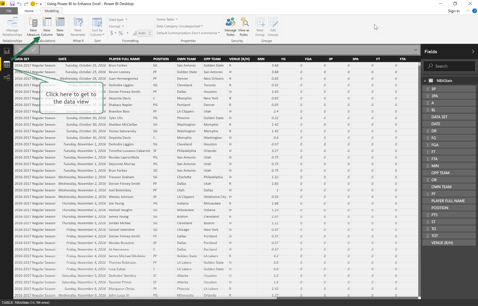
You can right-click on the dataset in the fields pane and select new column, but I like to do this on the data view tabs. To get there, click on the data table icon on the far-left side of the canvas to navigate to a view of your raw data. At the top, select the modeling tab on the ribbon and you’ll see a “New Column” button on that tab.
Adding a new column is very much the same as adding a measure. The same rules regarding the equals sign are in play here. However, you should not perform any aggregate functions here since the calculation will be performed for every row of your data set. The new column will always be added to the far right of your data set. It’s good practice to review the column and make sure your calculation is working as intended. The calculation I used for this new column is “Distinct Games = CONCATENATE(NBAStats[DATE],NBAStats[OWN TEAM])”.
Now, returning to my Report view by clicking on the bar chart icon on the far-left of the canvas, I’m ready to finish my measure. When I insert the measure, it will be added to my data set as a field and I can drag it to the visual fields like I would any other data field.
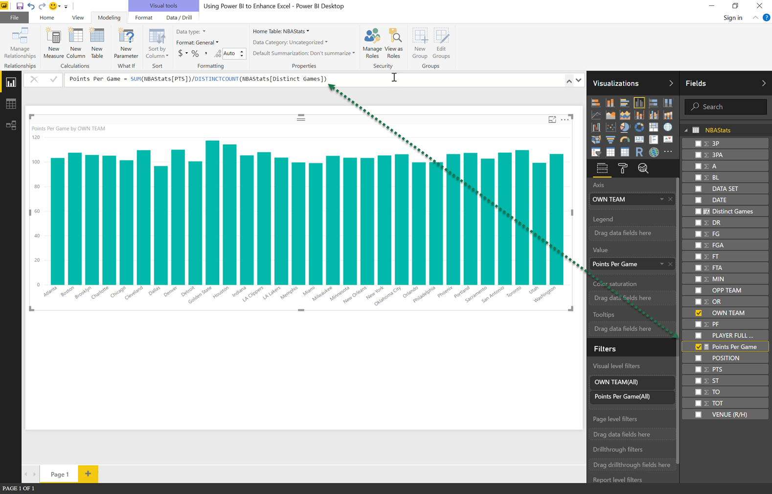
As you can see, the measure exists with a calculator icon in the fields pane on the right. When you click on it, you can see the calculation in the formula bar and make any edits you need to. One of the great things about measures is they work seamlessly with your data. I did not tell the measure to perform the calculation by team. I simply am dividing all points by the distinct count of games. The data model is doing the heavy lifting for me to convert this to a calculation filtered by team. This is where choosing to import date to Power BI from Excel can benefit you with time and speed. You can quickly create visuals without having to explicitly define the data source for your chart. The data model intuitively knows how to apply the filters.
I hope this brief introduction to working with Excel data in Power BI was helpful. I am a huge fan of this tool and, if you’re doing analysis of any kind, I think you should take the time to learn how to use it. I’ll be posting articles on it periodically so please let me know what you want to know about the tool in the comments so I can tailor the content for you all. I’ve zipped up the Power BI Desktop file and Excel data source file for you in the example files section of the site. You’ll need to reconnect the two files on your own computer as the path will be broken but it should give you a fun bit of data to play around with and learn the tool.
Cheers,
R
No Comments